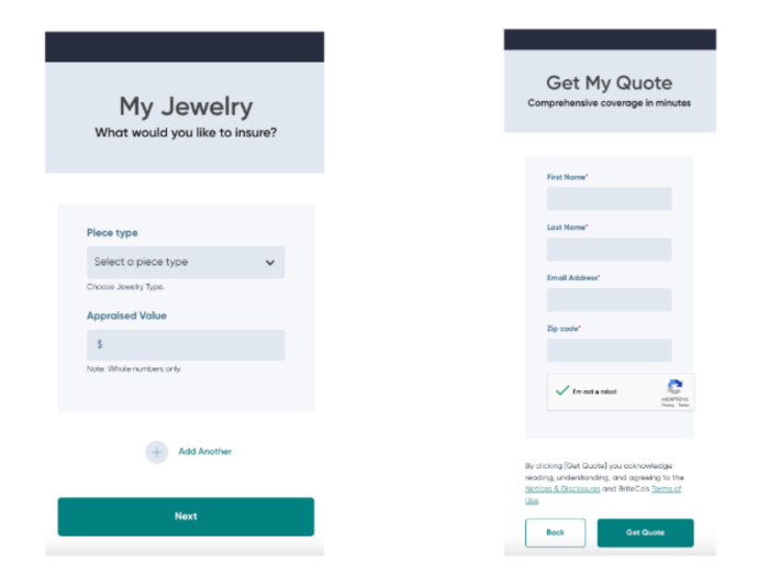
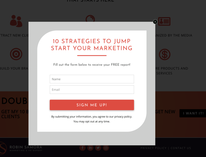
Optimizing Website Forms for Conversion dives deep into the art of maximizing form performance to drive more conversions, man. From key elements to best practices, this topic is all about taking your website to the next level.
Importance of Optimizing Website Forms for Conversion
When it comes to boosting those conversion rates, optimizing your website forms is the name of the game, yo! Ain’t nobody got time for boring, clunky forms that scare potential customers away. By fine-tuning those forms, you’re making it easier for users to interact with your site and making that cash money flow in smoother than ever.
Well-designed forms ain’t just about looking pretty – they can make or break that user experience, you feel me? Smooth navigation, clear instructions, and minimal fields to fill out can turn a frustrated user into a satisfied customer in no time. And let’s be real, happy customers mean more conversions for your biz!
Examples of Successful Websites with Optimized Forms
- Amazon: These guys know how to streamline the checkout process with autofill options, progress indicators, and error notifications. That’s why they’re killing the online shopping game!
- HubSpot: With their simple and intuitive forms, HubSpot makes it a breeze for visitors to sign up for their services. Talk about converting like a boss!
- Squarespace: From clean design to smart form validation, Squarespace nails it when it comes to optimizing their forms for maximum conversions. They’re the real MVPs of website building!
Elements of an Optimized Website Form

To create a well-optimized website form that maximizes conversion rates, several key elements need to be considered. These elements include form fields, layout, design, and call-to-action buttons. Each of these components plays a crucial role in guiding users through the form and encouraging them to take action.
Form Fields
Form fields are the sections where users input their information. It is essential to strike a balance between asking for enough information to qualify leads and not overwhelming users with too many fields. A high-converting form typically includes fields for essential information like name and email address, while avoiding unnecessary fields that can deter users from completing the form.
Layout
The layout of a form is critical for conversion optimization. A well-structured form that is easy to navigate and visually appealing can significantly impact conversion rates. Placing form fields in a logical order, using clear labels, and organizing the form into sections can help users move smoothly through the form and complete it successfully.
Design
The design of a website form can greatly influence user behavior. A visually appealing form with a clean and professional design is more likely to attract users and instill trust. Elements like color, typography, and spacing should be carefully considered to create a form that is both aesthetically pleasing and functional.
Call-to-Action Buttons
The call-to-action (CTA) button is the final step in the conversion process. It is essential to design a CTA button that stands out on the page, uses compelling language, and clearly indicates what will happen when clicked. High-converting forms often feature CTAs that are strategically placed, visually distinct, and use persuasive language to encourage users to take action.
Best Practices for Designing Conversion-Optimized Forms

When it comes to designing website forms that are optimized for conversion, there are several best practices to keep in mind. These practices focus on creating user-friendly forms that are clear, simple, and mobile-responsive, ultimately leading to higher completion rates and lower abandonment rates.
Importance of Simplicity in Form Design
Simplicity is key when it comes to designing conversion-optimized forms. Complex and cluttered forms can overwhelm users, leading to form abandonment. To ensure simplicity in form design:
- Avoid unnecessary form fields: Only ask for essential information to reduce friction.
- Use clear and concise labels: Make sure users understand what is required in each field.
- Keep the layout clean: Organize form elements in a logical order to guide users through the process.
Clarity and Mobile Responsiveness, Optimizing Website Forms for Conversion
In addition to simplicity, clarity and mobile responsiveness play a crucial role in form design. Users should be able to easily navigate and complete forms on any device. To achieve clarity and mobile responsiveness:
- Optimize for mobile: Ensure that forms are fully functional and easy to use on mobile devices.
- Use visual cues: Highlight important elements like form fields and buttons to guide users.
- Provide real-time feedback: Show users validation messages and errors as they fill out the form.
Reducing Abandonment and Increasing Completion Rates
To reduce form abandonment rates and increase completion rates, consider the following tips:
- Progressive disclosure: Break long forms into smaller sections to reduce user fatigue.
- Offer incentives: Provide users with a reason to complete the form, such as a discount or exclusive content.
- Optimize load times: Ensure that forms load quickly to prevent users from abandoning midway.
A/B Testing and Optimization Strategies: Optimizing Website Forms For Conversion
When it comes to optimizing website forms for better conversion rates, A/B testing plays a crucial role in determining what works best for your audience. A/B testing involves creating two versions of a form (A and B) with slight variations and then comparing their performance to see which one yields better results.
Different Strategies for A/B Testing Form Variations
A/B testing can be approached in various ways to maximize the effectiveness of your website forms. Here are some strategies to consider:
- Change in Form Layout: Test different layouts to see which one encourages more form completions.
- Alteration of Form Fields: Experiment with the number and types of fields to find the optimal balance between collecting information and user convenience.
- Call-to-Action Testing: Test different CTAs to see which one prompts more conversions.
- Color and Design Testing: Evaluate how different colors and designs impact user engagement and form submissions.
Data-Driven Optimization for Continuous Improvement
Utilizing data-driven optimization allows you to make informed decisions based on real user behavior and feedback. By analyzing metrics such as completion rates, drop-off points, and user interactions, you can continuously refine your forms for better performance. This iterative process ensures that your website forms are constantly evolving to meet the changing needs and preferences of your audience.
